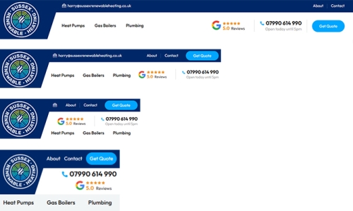
The burger menu has become the go-to solution for many web designers when screen sizes start to shrink and page styling gets a little tricky. Navigation and calls to action are simply tucked away off-screen.
In many cases, it’s a lazy fix that can harm website usability unnecessarily.
I’m a big believer in only using burger menus when absolutely necessary. If your website’s navigation has six or fewer top-level items, it’s worth considering whether you even need one.
If you do have more navigation items, you can still ensure that your key pages and primary calls to action remain visible. With some careful planning, your navigation can work beautifully - even on the smallest screens.
Universal navigation takes more time to develop, but it delivers a consistent user experience. It ensures your key pages are always clearly signposted, no matter the device.
A great example is The Guardian newspaper, which maintains a consistent navigation structure across all screen sizes. Many of my recent websites follow the same principle, and the results speak for themselves.

Sliding navigation provides an alternative to traditional 'show and hide' navigation. eBay were pioneers with many more websites such as YouTube and the BBC embracing sliding navigation more recently.
Sliding navigation can be activated by mouse drag or a swipe on a touch screen device. It's important to make it clear to user that additional options are listed just off the screen.
A common pitfall of burger menus is that they can tuck away important call to action buttons (e.g. ‘Get a quote’, ’Contact Us’, ‘Buy Now’).
Regardless of screen size and navigation and style, you should aim to ensure that your CTA’s remain visible and prominent on your website, across all device types and screen sizes.
When your CTA is visible at all time, you remove barriers for user action - whether that’s requesting a quote, booking a service or buying a product.

For many websites, there’s no reason to hide menus behind burger icons. With smart planning and responsive layout, you can deliver:
With thoughtful structure and style, you can keep your site navigation and your CTAs, clear, accessible and consistent on every device, no compromises needed.